

どんな記事?
この記事では、以下の手順とコードを紹介しています。
- 投資の「期待値」の算出
- 投資の「単利・複利の『損益分岐点』」の算出
- 算出結果をもとにグラフを描画
数値等の詳細について
詳細については以下の記事をお読みください。
必要なモジュールのインストールと読み込み
GoogleColab:Cell-1
!pip install plotly --upgrade

import numpy as np
import pandas as pd

import plotly
import plotly.graph_objs as go
import plotly.figure_factory as ff
plotly.offline.init_notebook_mode( connected=True )

# google colabでplotlyを表示するにはこれが必要。
# グラフを書き出すセルごとに使用する
def enable_plotly_in_cell():
    import IPython
    from plotly.offline import init_notebook_mode
    display(IPython.core.display.HTML('''
            <script src="/static/components/requirejs/require.js"></script>
    '''))
    init_notebook_mode( connected=False )
期待値の算出
リスクを「1」とした場合の期待値を算出。
GoogleColab:Cell-2
def calc_edge( win ,rr ) :
    return win * rr - abs( 1 - win )

if __name__=='__main__' :
    win = 0.4176
    rr = 2.044
    print( calc_edge( win ,rr ) )
以下のように算出される。
0.27117440000000004期待値一覧表の作成
GoogleColab:Cell-3
win_range = np.arange(0.7 ,0.2 ,-0.02)
rr_range  = np.arange(0.1 ,4.1 ,0.1)

df_edge = pd.DataFrame()
for win in win_range :
    for rr in rr_range :
        edge = calc_edge( win ,rr )
        df_edge.loc[rr ,f'{ win :.0%}'] = f'{ round( edge ,3 ) }'

df_edge
Surface(3D)グラフの作成
半透明の部分が、期待値の「プラスとマイナスの境い目」。
GoogleColab:Cell-4
layout = go.Layout( title         = '期待値の変化'
                  , autosize      = False
                  , paper_bgcolor = "#000"
                  , width         = 1000
                  , height        = 800
                  , scene = dict(
                          aspectmode  = "manual"
                        , aspectratio = dict(x=1 ,y=1 ,z=0.5)
                        , xaxis = dict(color="#fff" ,linecolor="#fff" ,gridcolor="#eee" ,title="勝率")
                        , yaxis = dict(color="#fff" ,linecolor="#fff" ,gridcolor="#eee" ,title="リスクリワード比率")
                        , zaxis = dict(color="#fff" ,linecolor="#fff" ,gridcolor="#eee" ,title="期待値")
                        , camera = dict(eye=dict(x=-1.5 ,y=-1 ,z=.9)) )
                  , font = dict(color="#fff") )

z1 = df_edge

data = [ go.Surface( z = np.zeros(( len(z1.index) ,len(z1.columns) ))
                   , y = z1.index
                   , x = z1.columns
                   , showscale=False
                   , opacity=0.7 )
       , go.Surface( z = z1.as_matrix()
                   , y = z1.index
                   , x = z1.columns

                   , colorscale = "Jet"
                   , colorbar   = dict(lenmode='fraction', len=0.5)
                   , contours   = dict(x=dict(color="#fff") ,y=dict(color="#fff") ,z=dict(color="#fff")) ) ]


enable_plotly_in_cell()
plotly.offline.iplot( go.Figure( data=data ,layout=layout ) )
Contour(等高線)グラフの作成
「0」のラインが、期待値「±0」を表す。ゼロラインより右上ならプラス、左下ならマイナスの期待値。
GoogleColab:Cell-5
layout = go.Layout( title    = '期待値の変化'
                  , autosize = False
                  , xaxis    = dict( title="リスクリワード比率" )
                  , yaxis    = dict( title="勝率(%)" )
                  , width    = 1000
                  , height   = 800
                  , font     = dict( size=16 ) )

z1 = df_edge

data = [ go.Contour( z = z1.T.as_matrix()
                   , x = z1.index
                   , y = z1.columns
                   , colorscale = 'Jet' ) ]

enable_plotly_in_cell()
plotly.offline.iplot(go.Figure(data=data ,layout=layout))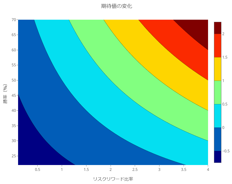
複利の損益分岐点(均衡利益率)の算出とグラフ
GoogleColab:Cell-6
def calc_compound_break_even_profit_rate( win_rate ,loss_pct ) :
    return ( 1 - loss_pct )**( 1 - 1 / win_rate ) - 1

def calc_simple_break_even_profit_rate( win_rate ,loss_pct ) :
    return ( 1 - win_rate ) * loss_pct / win_rate

def df_break_even_profit( win_range ,loss_range ,comp_simp ) :
    raw = pd.DataFrame()
    for win_rate in win_range :
        for loss_pct in loss_range :
            for manage in comp_simp :
                row = f'{ win_rate :.0%}'
                col = f'{ manage } { loss_pct :.0%}'
                if manage=='複利' :
                    calc_result = f'{ calc_compound_break_even_profit_rate( win_rate ,loss_pct ) :%}'
                if manage=='単利' :
                    calc_result = f'{ calc_simple_break_even_profit_rate( win_rate ,loss_pct ) :%}'
                raw.loc[ row ,col ] = calc_result
    return raw

def make_graph( df ) :
    layout = go.Layout( title    = '損益均衡点'
                      , autosize = False
                      , xaxis    = dict( title="勝率(%)" )
                      , yaxis    = dict( title="均衡利益率" )
                      , width    = 1000
                      , height   = 800
                      , font     = dict( size=16 ) )
    data = [ go.Scatter( x = df.index
                       , y = df[ col ]
                       , mode = 'lines'
                       , name = col )
           for col in df.columns ]
    enable_plotly_in_cell()
    plotly.offline.iplot(go.Figure(data=data ,layout=layout))

if __name__=='__main__' :
    win_range = np.arange(0.7 ,0.2 ,-0.02)
    loss_range = [ 0.05 ,0.1 ,0.2 ]
    comp_simp = ['複利' ,'単利']
    df = df_break_even_profit( win_range ,loss_range ,comp_simp )
    make_graph( df )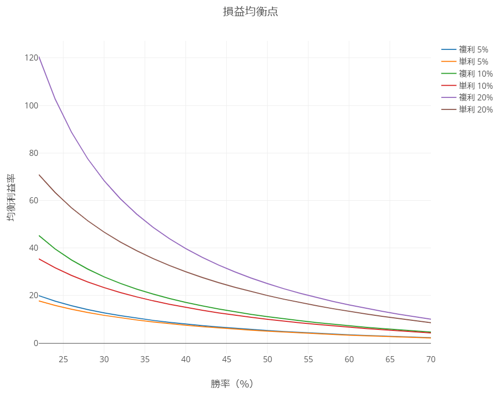
複利の損益分岐点(RR)の算出とグラフ
「複利の損益分岐点(均衡利益率)」に少し手を加えて「RR」で確認できるようにし、縦・横軸を「破産の確率」のグラフに合わせたもの。
GoogleColab:Cell-7
def calc_compound_break_even_rr( win_rate ,loss_pct ) :
    profit_pct  = ( 1 - loss_pct )**( 1 - 1 / win_rate ) - 1
    risk_reward = profit_pct / loss_pct
    return risk_reward

def calc_simple_break_even_rr( win_rate ,loss_pct ) :
    profit_pct  = ( 1 - win_rate ) * loss_pct / win_rate
    risk_reward = profit_pct / loss_pct
    return risk_reward

def df_break_even_rr( win_range ,loss_range ,comp_simp ) :
    raw = pd.DataFrame()
    for win_rate in win_range :
        for loss_pct in loss_range :
            for manage in comp_simp :
                row = f'{ win_rate :.0%}'
                col = f'{ manage } { loss_pct :.0%}'
                if manage=='複利' :
                    calc_result = f'{ calc_compound_break_even_rr( win_rate ,loss_pct ) :.5}'
                if manage=='単利' :
                    calc_result = f'{ calc_simple_break_even_rr( win_rate ,loss_pct ) :.5}'
                raw.loc[ row ,col ] = calc_result
    return raw

def make_graph( df ) :
    layout = go.Layout( title    = '損益均衡点'
                      , autosize = False
                      , yaxis    = dict( title="勝率(%)" )
                      , xaxis    = dict( title="リスクリワード比率" )
                      , width    = 1000
                      , height   = 500
                      , font     = dict( size=16 ) )
    data = [ go.Scatter( y = df.index
                       , x = df[ col ]
                       , mode = 'lines'
                       , name = col )
           for col in df.columns ]
    enable_plotly_in_cell()
    plotly.offline.iplot(go.Figure(data=data ,layout=layout))

if __name__=='__main__' :
    win_range  = np.arange(0.6 ,0.2 ,-0.02)
    loss_range = [ 0.02 ,0.05 ,0.1 ,0.2 ]
    comp_simp  = ['複利' ,'単利']
    df = df_break_even_rr( win_range ,loss_range ,comp_simp )
    make_graph( df )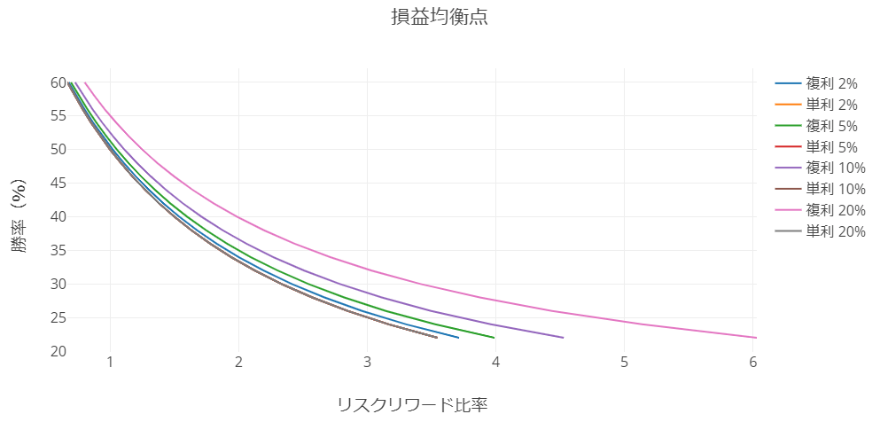
開発を承っています
- Pineスクリプト(インジケーターやストラテジー)
- Google Apps Script
- Python
- MQL4
などの開発を承っています。とくに投資関連が得意です。過去の事例は「実績ページ(不定期更新)」でご確認ください。ご相談は「お問い合わせ」からお願いします。


目次
- どんな記事?
- 数値等の詳細について
- 必要なモジュールのインストールと読み込み
- 期待値の算出
- 期待値一覧表の作成
- Surface(3D)グラフの作成
- Contour(等高線)グラフの作成
- 複利の損益分岐点(均衡利益率)の算出とグラフ
- 複利の損益分岐点(RR)の算出とグラフ
- 記事をシェア