

どんな記事
分散投資をする際によく用いられる「相関」を、Google Colaboratory(Python)で算出する方法の備忘録。以下を行った。
- TA-Libでピアソンの積立相関係数
- numpyでピアソンの積立相関係数
- Scipyでスピアマンの順位相関係数
- Scipyでケンドールの順位相関係数
- Plotlyでヒートマップを作成
- Plotlyで3DのSurfaceグラフを作成
追記
2021年2月17日
TA-Libの相関係数に不具合が見られたため、numpyでの算出方法を追記。その他、コードの調整と整理。
必要なモジュールの読み込み
import pandas as pd
import pandas_datareader.data as web
import numpy as np
from scipy import stats

import plotly
import plotly.graph_objs as go
TA-Libを使う場合は、以下のコードでインストールと読み込みを行う。
!cd /content && curl -L http://prdownloads.sourceforge.net/ta-lib/ta-lib-0.4.0-src.tar.gz -O && tar xzvf ta-lib-0.4.0-src.tar.gz
!cd /content/ta-lib && ./configure --prefix=/usr && make && make install && cd ..
!pip install ta-lib
import talib as ta
データの取得
検証用のサンプルデータの取得は、pandas_datareaderでFREDから。Stooqやyahooはうまく動作しなかった。幸い、終値だけで事足りるので、FREDのデータで十分。
start = '2020/1/1'
symbols = { 'EURUSD': 'DEXUSEU',
            'GBPUSD': 'DEXUSUK',
            'USDJPY': 'DEXJPUS',
            'USDCHF': 'DEXSZUS',
            'AUDUSD': 'DEXUSAL',
            'USDCAD': 'DEXCAUS',
            'NZDUSD': 'DEXUSNZ' }

def get_prices( symbolsDict ,start ) :
    fredCodeList = [ symbolsDict[symbol] for symbol in symbolsDict ]
    df = web.DataReader( fredCodeList ,'fred' ,start )
    renameDict = { symbolsDict[symbol] : symbol  for symbol in symbolsDict }
    return df.rename( columns=renameDict ).ffill()[1:]

df = get_prices( symbols ,start )
データを取得するためのFREDのコードは以下の通り。
| 通貨 | FREDコード | FRED銘柄名 |
|---|---|---|
| EURUSD | DEXUSEU | U.S. / Euro Foreign Exchange Rate |
| GBPUSD | DEXUSUK | U.S. / U.K. Foreign Exchange Rate |
| USDJPY | DEXJPUS | Japan / U.S. Foreign Exchange Rate |
| USDCHF | DEXSZUS | Switzerland / U.S. Foreign Exchange Rate |
| AUDUSD | DEXUSAL | U.S. / Australia Foreign Exchange Rate |
| USDCAD | DEXCAUS | Canada / U.S. Foreign Exchange Rate |
| NZDUSD | DEXUSNZ | U.S. / New Zealand Foreign Exchange Rate |
関数を作成しておく
よく使う処理を関数にしておく。
def plot_heatmap( cor_dict, target ) :
  layout = go.Layout( title='', autosize=False, width=1200, height=330 )
  z1 = cor_dict[ target ].drop( target ,axis=1 )
  data = [ go.Heatmap( z=z1.T.values, y=z1.columns, x=z1.index,
                       zmin=-1, zmax=1,
                       colorscale=[[0    ,"rgb(255 ,0   ,0)"],
                                   [0.2  ,"rgb(255 ,235 ,59)"],
                                   [0.45 ,"rgb(255 ,255 ,255)"],
                                   [0.55 ,"rgb(255 ,255 ,255)"],
                                   [0.8  ,"rgb(255 ,235 ,59)"],
                                   [1.0  ,"rgb(255 ,0   ,0)"]] ) ]
  plotly.offline.iplot( go.Figure( data=data, layout=layout.update( dict( title=target ) ) ) )

def plot_surface( cor_dict, target ) :
  layout = go.Layout( title='', autosize=False,
                      paper_bgcolor="#000", width=1200, height=800,font=dict(color="#fff"),
                      scene=dict( aspectmode="manual", aspectratio=dict(x=1,y=2,z=0.5),
                                  xaxis=dict( color="#fff", linecolor="#fff", gridcolor="#eee", title="Symbol" ,nticks=15 ),
                                  yaxis=dict( color="#fff", linecolor="#fff", gridcolor="#eee", title="Date" ,type="date" ),
                                  zaxis=dict( color="#fff", linecolor="#fff", gridcolor="#eee", title="Correlation" ),
                                  camera=dict( eye=dict( x=2, y=1.25, z=1.5 ) ) ) )
  z1 = cor_dict[ target ].drop( target ,axis=1 )
  data = [ go.Surface(z=z1.values, y=z1.index, x=z1.columns,
                      cmin=-1, cmax=1,
                      colorscale="Jet",
                      colorbar=dict( lenmode='fraction' ,len=0.5 ),
                      contours=dict( x=dict(color="#fff"), y=dict(color="#fff"), z=dict(color="#fff" ) ) ) ]
plotly.offline.iplot( go.Figure( data=data, layout=layout.update( dict( title=target ) ) ) )def operator( df, def_correl, timeperiod=30 ) :
df = df.copy()
np_price = { sym:np.array(df.loc[: ,sym] ,dtype='f8') for sym in df.columns }
cor_dict = {}
for sym_i in df.columns :
raw = pd.DataFrame()
for sym_j in df.columns :
correl = calc_correl( np_price[ sym_i ] ,np_price[ sym_j ] ,timeperiod )
raw[ sym_j ] = correl
raw.index = df.index
cor_dict[ sym_i ] = raw
return cor_dictピアソンの積立相関係数
普段よく見かけれる相関係数はこれ。numpyで算出する。
def calc_correl( list1, list2, timeperiod=20 ) :
  list_nan = np.array( [ np.nan for i in range( timeperiod - 1 ) ] )
  if len( list1 ) == len( list2 ) : list_length = len( list1 ) - ( timeperiod - 1 )
  else : raise Exception( 'list1とlist2の要素数が異なります' )
  list_target1 = np.array( [ list1[ i : i + timeperiod ] for i in range( list_length ) ] )
  list_target2 = np.array( [ list2[ i : i + timeperiod ] for i in range( list_length ) ] )
  return np.append( list_nan ,np.array( list( map( lambda a, b : np.corrcoef( a, b )[0,1], list_target1, list_target2 ) ) ) )

cor_dict1 = operator( df, calc_correl )cor_dict1['EURUSD'].tail()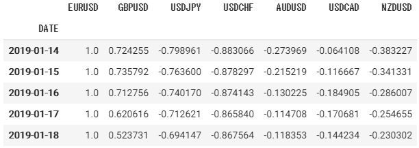
ヒートマップ
plot_heatmap( cor_dict1, 'EURUSD' )
3D Surfaceグラフ
plot_surface( cor_dict1, 'GBPUSD' )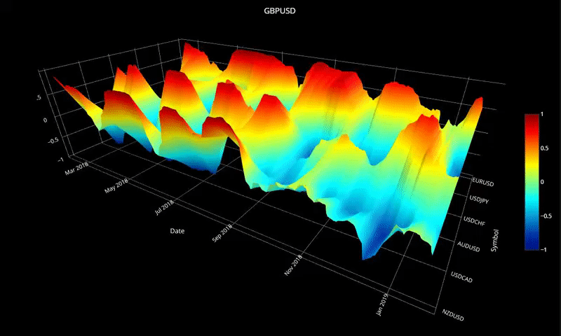
TA-Libの不具合
手元では、全く同じデータの相関が1にならない現象を確認した。1になるべきすべてのケースで起こるわけではなく、特定の条件下で起こっているような挙動。それ以上の原因は特定せず、numpyで代用している。
もし、TA-Libで算出する場合は以下のコードで算出できる。
cor_dict1 = operator( df, ta.CORREL )スピアマンの順位相関係数を算出する
Scipyで算出する。
def calc_correl_spearmanr( np_ar1 ,np_ar2 ,timeperiod ) :
  len1 = len(np_ar1)
  len2 = len(np_ar2)
  if len1==len2 :
    result = []
    for i in range( len1 ) :
      if i < timeperiod-1 :
        result.append(np.nan)
      else :
        a = i - (timeperiod-1)
        b = i + 1
        correlation ,pvalue = stats.spearmanr( np_ar1[a:b] ,np_ar2[a:b] )
        result.append( correlation )
    return np.array( result )
  else : raise

cor_dict2 = operator( df, calc_correl_spearmanr )cor_dict2['EURUSD'].tail()
ヒートマップ
plot_heatmap( cor_dict2, 'EURUSD' )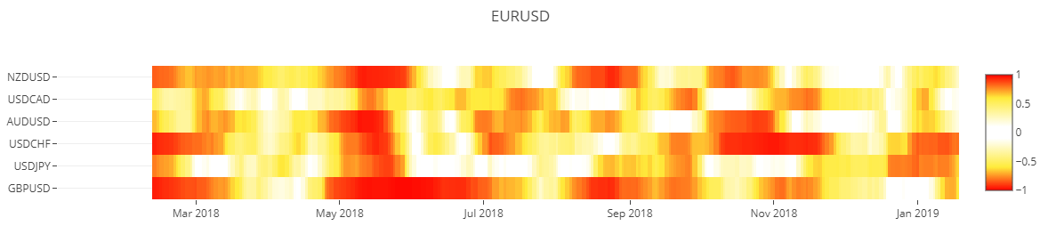
3D Surfaceグラフ
plot_surface( cor_dict2, 'GBPUSD' )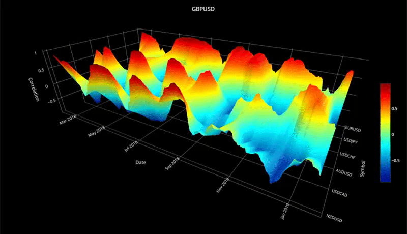
ケンドールの順位相関係数
Scipyで算出。
def calc_correl_kendalltau( np_ar1 ,np_ar2 ,timeperiod ) :
  len1 = len(np_ar1)
  len2 = len(np_ar2)
  if len1==len2 :
    result = []
    for i in range( len1 ) :
      if i < timeperiod-1 :
        result.append(np.nan)
      else :
        a = i - (timeperiod-1)
        b = i + 1
        correlation ,pvalue = sp.stats.kendalltau( np_ar1[a:b] ,np_ar2[a:b] )
        result.append( correlation )
    return np.array( result )
  else : raise

cor_dict3 = operator( df, calc_correl_kendalltau )cor_dict3['EURUSD'].tail()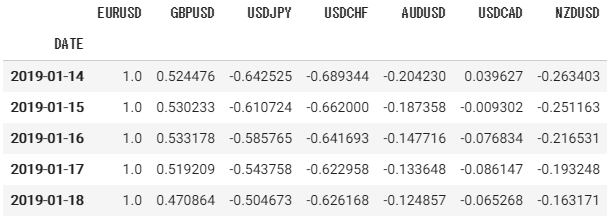
ヒートマップ
plot_heatmap( cor_dict3, 'EURUSD' )
3D Surfaceグラフ
plot_surface( cor_dict3, 'GBPUSD' )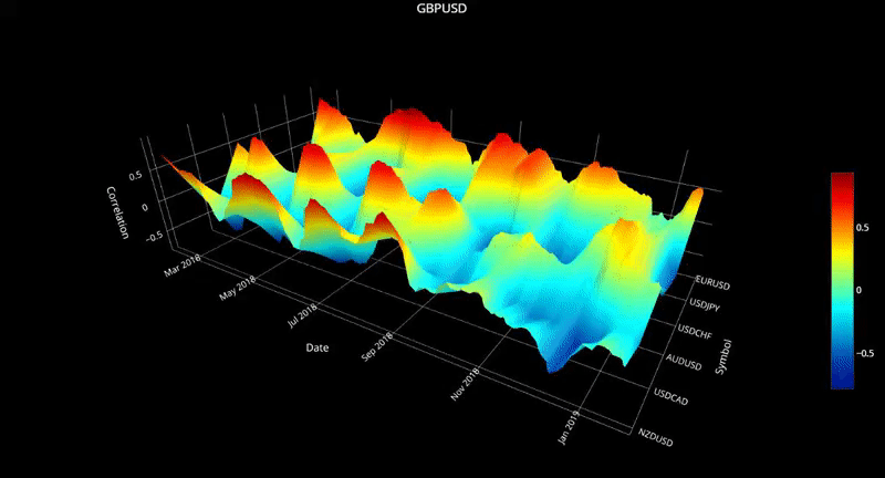
target = 'GBPUSD'
layout = go.Layout( title = ''
, autosize = False
, paper_bgcolor = "#000"
, width = 1200
, height = 800
, scene = dict(
aspectmode = "manual"
, aspectratio = dict(x=1 ,y=2 ,z=0.5)
, xaxis = dict(color="#fff" ,linecolor="#fff" ,gridcolor="#eee" ,title="Symbol" ,nticks=15)
, yaxis = dict(color="#fff" ,linecolor="#fff" ,gridcolor="#eee" ,title="Date" ,type="date")
, zaxis = dict(color="#fff" ,linecolor="#fff" ,gridcolor="#eee" ,title="Correlation")
, camera = dict(eye=dict(x=2 ,y=1.25 ,z=1.5)) )
, font = dict(color="#fff") )
z1 = cor_dict3[ target ].drop( target ,axis=1 )
data = [ go.Surface( z = z1.as_matrix()
, y = z1.index
, x = z1.columns
, cmin=-1 ,cmax=1
, colorscale = "Jet"
, colorbar = dict(lenmode='fraction', len=0.5)
, contours = dict(x=dict(color="#fff") ,y=dict(color="#fff") ,z=dict(color="#fff")) ) ]
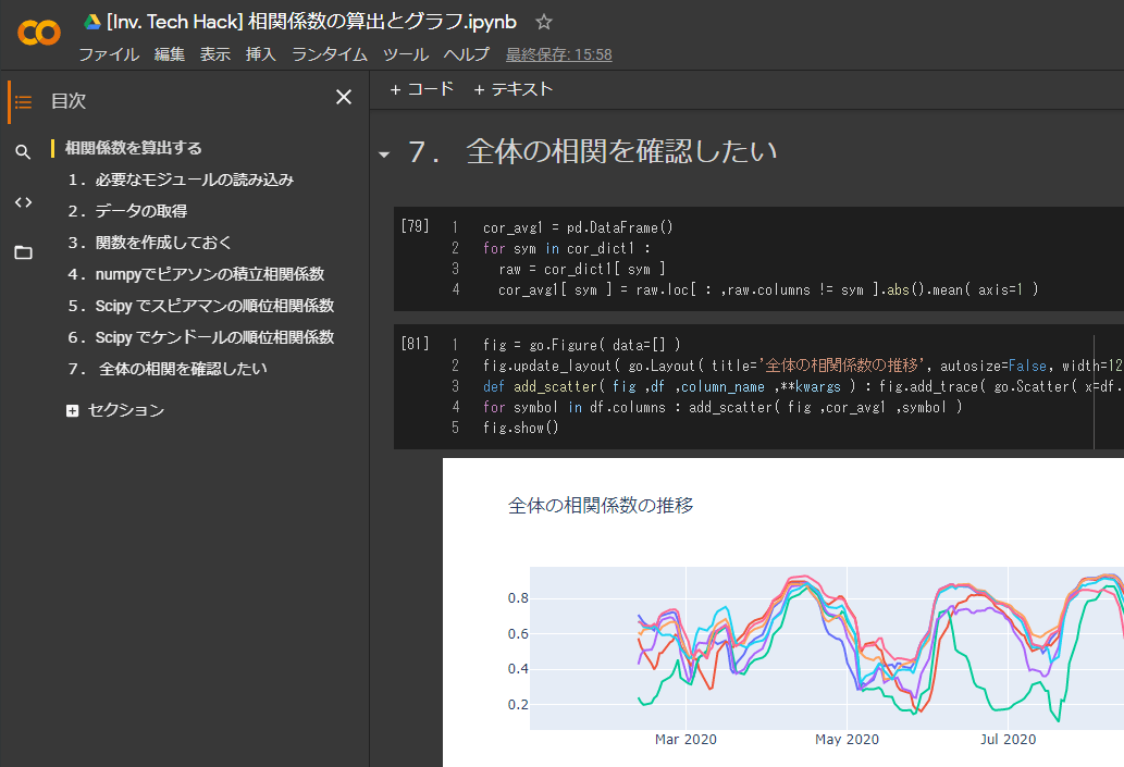
plotly.offline.iplot(go.Figure(data=data ,layout=layout.update(dict(title=target))))全体の相関係数の推移を調べる
- データの構造
{ symbol1: { symbol2: { Dates: values } } } - ここまでグラフ化したのは「ひとつのsymbol1 ✕ すべてのsymbol2 ✕ Date ✕ values」
- 「すべてのsymbol1 ✕ すべてのsymbol2 ✕ Date ✕ values」をひとつのグラフで確認したい
symbol1ごとに平均をつくることで、近いものを実現したい。絶対値(abs())とることで、正の相関と逆相関を同じように扱っている。
cor_avg1 = pd.DataFrame()
for sym in cor_dict1 :
  raw = cor_dict1[ sym ]
cor_avg1[ sym ] = raw.loc[ : ,raw.columns != sym ].abs().mean( axis=1 )fig = go.Figure( data=[] )
fig.update_layout( go.Layout( title='全体の相関係数の推移', autosize=False, width=1200, height=330 ) )
def add_scatter( fig ,df ,column_name ,**kwargs ) : fig.add_trace( go.Scatter( x=df.index ,y=df[ column_name ] ,name=column_name ,**kwargs ) )
for symbol in df.columns : add_scatter( fig ,cor_avg1 ,symbol )
fig.show()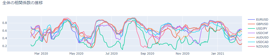
完璧ではないが、ヒートマップを何十枚も見比べる必要はなくなる。
このグラフをみると、2020年6月や9月頃に全体の相関急激な変化を見せたことが分かる。相場全体が一気に動くような事態が起こっていた可能性がありそう。
さらに平均をとっても面白い。
cor_avg_avg1 = pd.DataFrame()
cor_avg_avg1['avg'] = cor_avg1.mean( axis=1 )fig = go.Figure( data=[] )
fig.update_layout( go.Layout( title='全体の相関係数の推移', autosize=False, width=1200, height=330 ) )
def add_scatter( fig ,df ,column_name ,**kwargs ) : fig.add_trace( go.Scatter( x=df.index ,y=df[ column_name ] ,name=column_name ,**kwargs ) )
add_scatter( fig ,cor_avg_avg1 ,'avg' )
fig.show()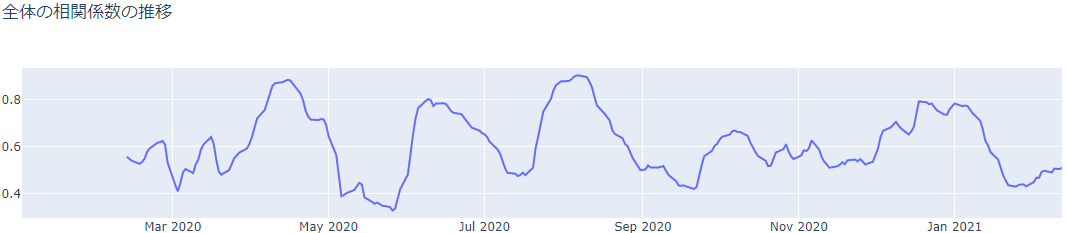
Google Colaboratory
使用したGoogle Colaboratoryを置いておきます。以下からアクセスしてください。
参考
ピアソン、スピアマン、ケンドールの相関係数の違いは、以下がわかりやすかった。
開発を承っています
- Pineスクリプト(インジケーターやストラテジー)
- Google Apps Script
- Python
- MQL4
などの開発を承っています。とくに投資関連が得意です。過去の事例は「実績ページ(不定期更新)」でご確認ください。ご相談は「お問い合わせ」からお願いします。


- どんな記事
- 追記
- 必要なモジュールの読み込み
- データの取得
- 関数を作成しておく
- ピアソンの積立相関係数
- スピアマンの順位相関係数を算出する
- ケンドールの順位相関係数
- 全体の相関係数の推移を調べる
- Google Colaboratory
- 参考
- 記事をシェア